
Healthcare startup brand transformation

Telcare, Inc.
Telcare, a healthcare startup, initially needed marketing materials to promote their flagship product to medical providers and patients. At the start of the project they were entering a phase of reorganization. Budget constraints and timeline pressures required efficient solutions adapting to their changing business structure. I saw the restructuring as a strategic moment to pitch a rebrand, including a new visual identity system and communications guidelines positioning the company for growth.
My role: Strategic design consultant, expanding project scope beyond initial brief while working directly with leadership during restructuring phase.
Strategic approach:
- Identified strategic opportunity to propose comprehensive rebrand during restructuring
- Presented business case for expanded scope, demonstrating long-term value over piecemeal approach
- Developed complete visual identity system supporting future product launches
- Created marketing material templates that internal teams could maintain and adapt
- Delivered brand guidelines ensuring consistency through growth phase
Impact: Successfully presented the comprehensive rebrand, transforming simple marketing materials request into strategic brand transformation positioning the company for growth during restructuring.
Deliverables:
- Complete visual identity and logo design
- Medical device packaging system
- Healthcare publication materials
- Website and mobile interface design
- Custom iconography system
Brand Development Process
Telcare was phasing out their original logo. There were various versions of an interim logotypes that were being used in communications and marketing collateral. The inconsistencies with logo usage and color pallet were causing significant confusion and did not support a cohesive brand experience.
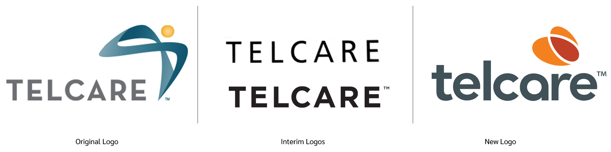
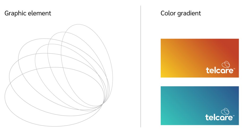
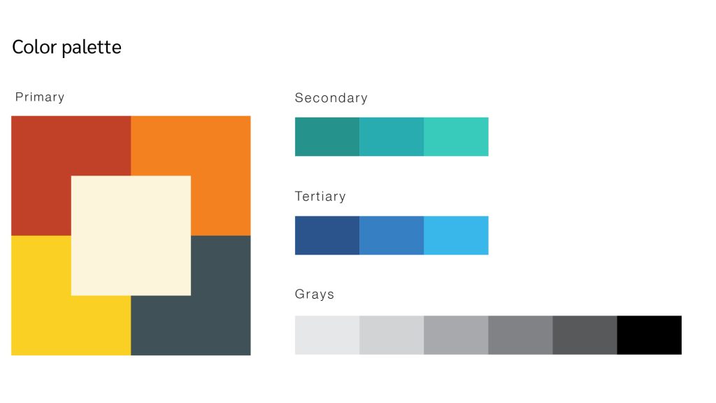
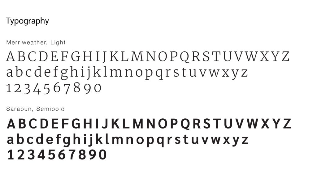
brand Identity transformation
I developed a clean logotype based on humanistic type forms. The integrated mark is derived from the small blood droplet that is required for accurate testing. The concentric circles represent repetition and technical accuracy.

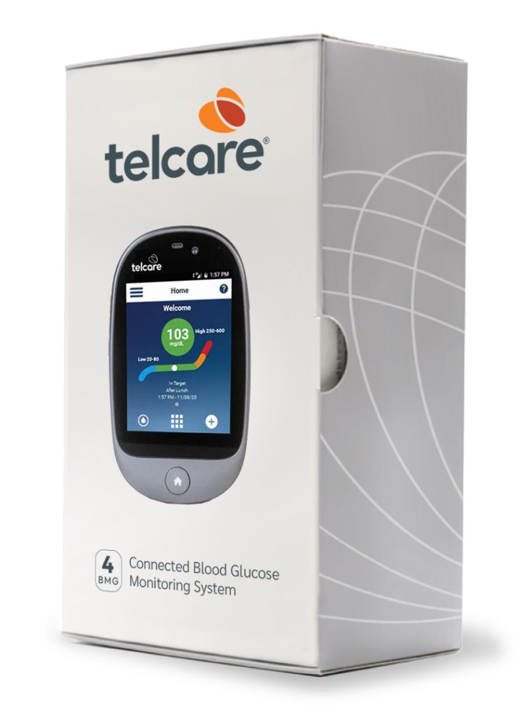
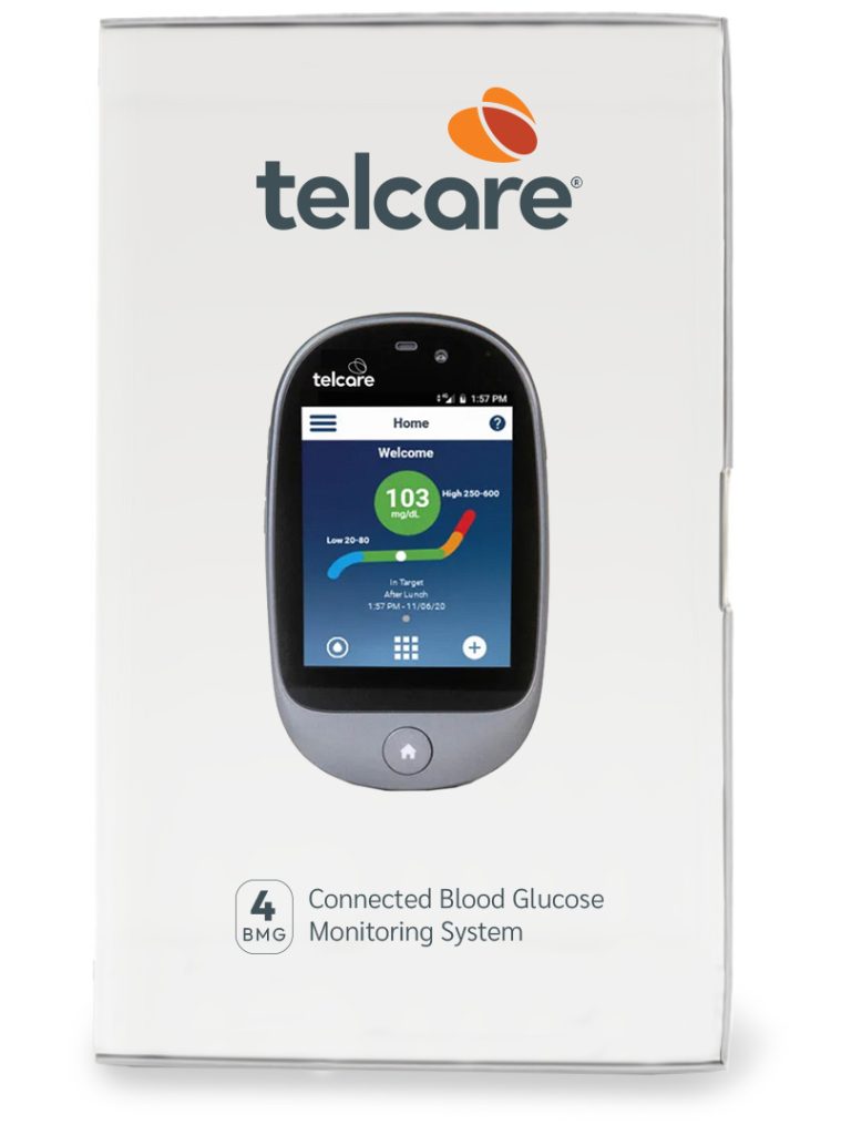
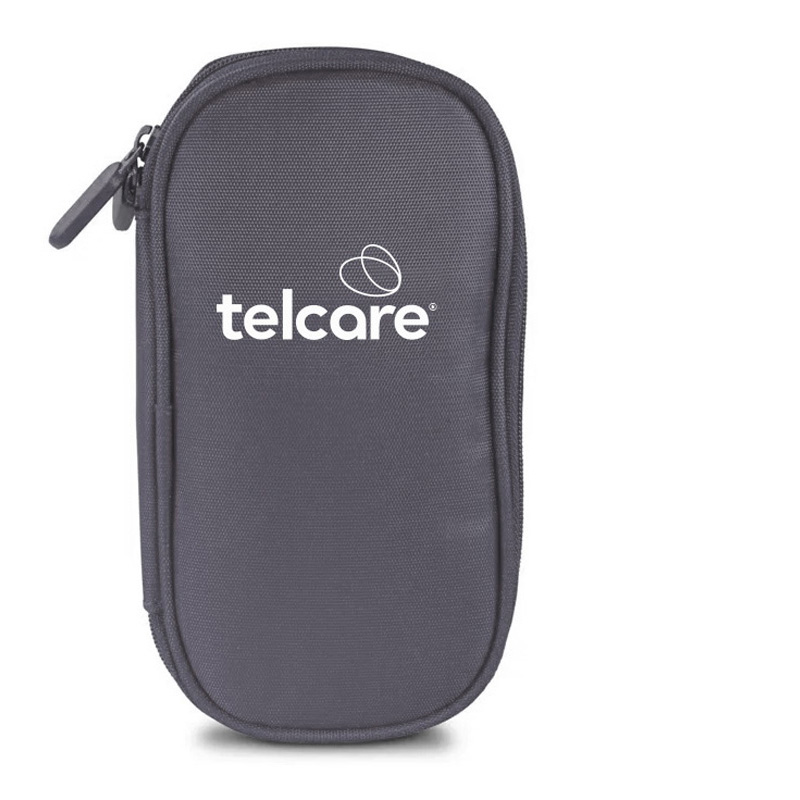
Medical Device Packaging
Premium healthcare packaging system including retail boxes and protective carrying case. The design prioritizes user accessibility while maintaining compliance standards, creating professional presentation building consumer confidence.
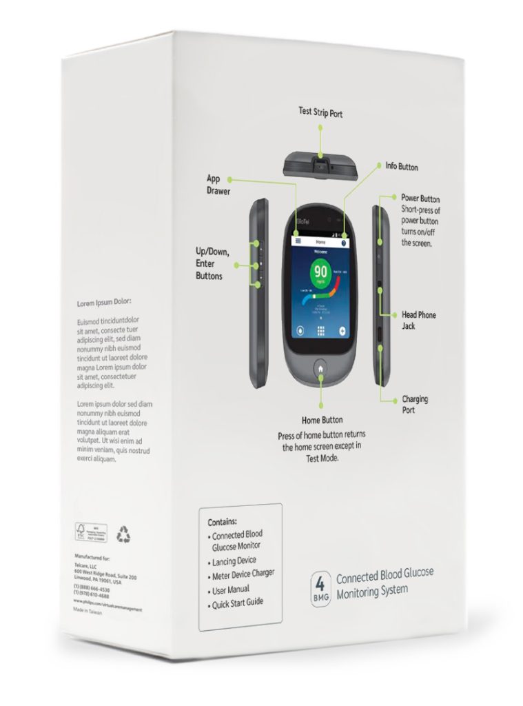
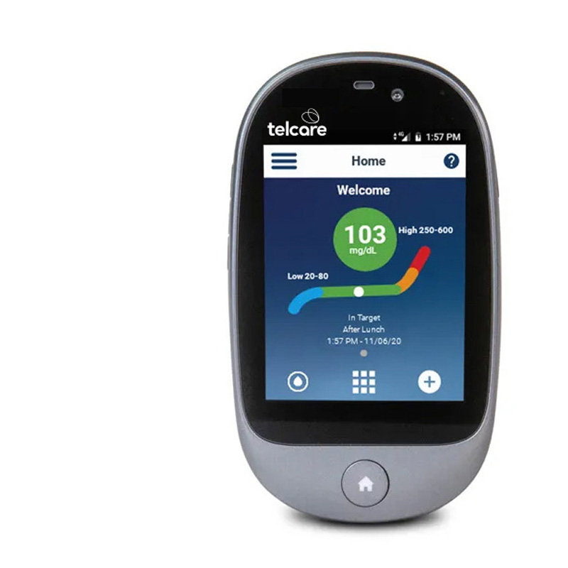
Healthcare Interface Icons
A versatile icon system developed for digital dashboards and patient instructions. Designed for clarity and consistency across both digital and print platforms. The icons create an intuitive user experience for medical professionals and patients alike.
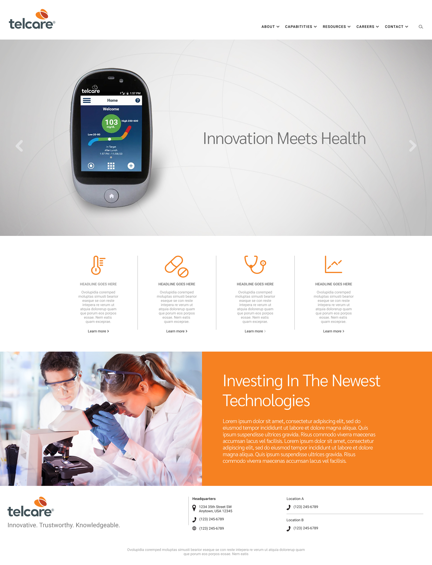
Marketing Website
Website refresh supporting new brand identity showing look and feel with focus on healthcare professional acquisition. Clean, modern interface emphasizes product benefits and clinical validation while maintaining accessibility standards for diverse user needs.
|